Maria Romera Jolliff
Hi there! Welcome to my site. "Mria" is a sort of a nickname; it's the way my name sounds if you say it really fast ;-)
My experience ranges from Human Factors research and engineering to Mobile Design. I coded this site by hand, and learned enough JS/Jquery to produce this slideshow. Pause or Play to get an overview of some projects, and be sure to checkout a deeper description of design process in the case studies. Take a look around, but be sure to skip over to my newer site using Wix and check that out too!
Overview of Project Work
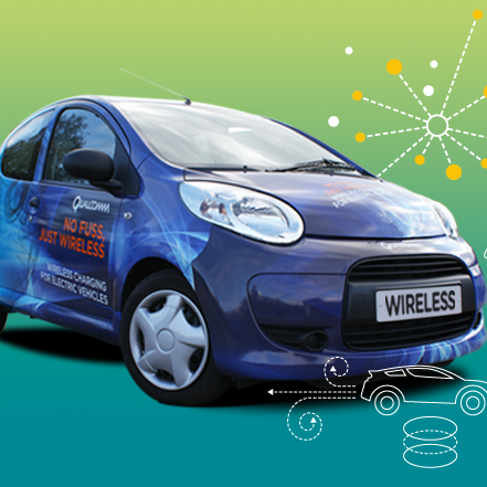
QC Halo: As Featured on SlashGear



Some examples of my projects...
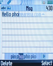
In my 3 years at Motorola, a good portion of that was spent on input and text entry. I did localization for Greek, Arabic, Hindi, and some Chinese. I worked closely with native speakers and did research that you can find in my Localization page. I worked with the user experience team on a complete redesign of the UI called Chameleon. I collaborated with others on advanced text features such as next-word prediction that are now seen regularly in modern phones.
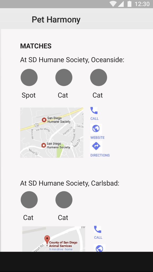
A quick design exercise that resulted in medium fidelity wireframes. "Pet Harmony" asks you lifestyle questions for the purpose of both matching you with your ideal pet, and finding homes for cats and dogs in local shelters. Checkout my design process and see the resulting flow through the app in Case Studies.
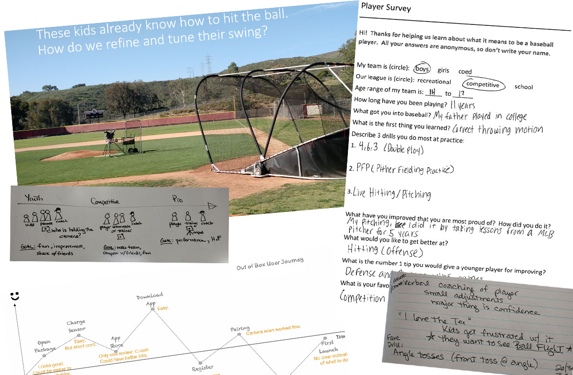
This was a six month redesign project from user research to wireframes. Resulted in iOS Wireframe specification for a mobile app using a wearable sensor. See Case Study.
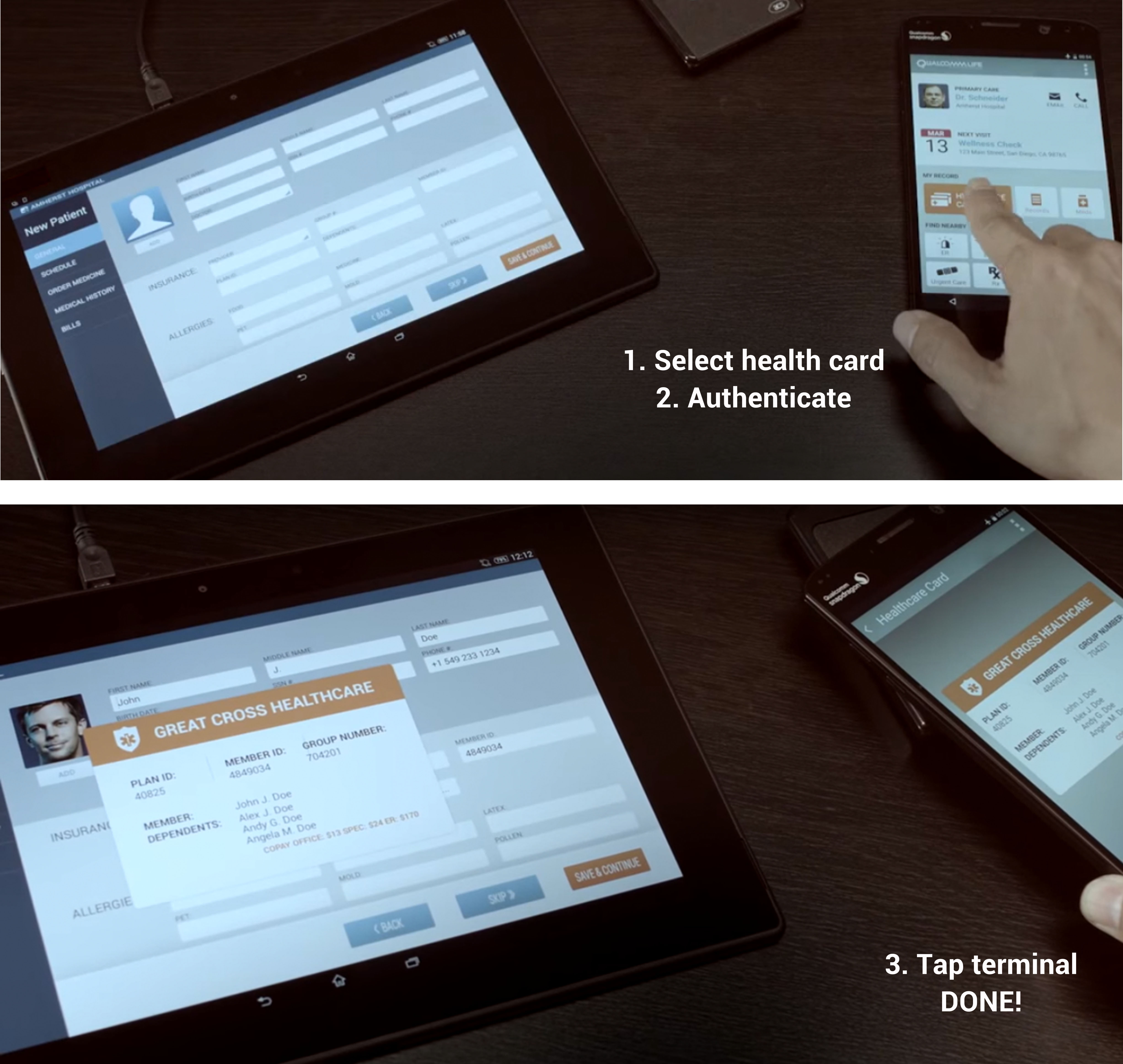
Presented at Mobile World Congress 2015. I worked alongside my graphic design partner to clarify requirements with business development and engineering. We had to narrow down and focus the story, script the story, and get signoff. I put together the content and flow of screens. The user goes to a new doctor and uses his phone to wirelessly send his healthcare info, secured with biometric authentication and other security technologies.
As part of a proposed tool set to be provided with Qualcomm Zeroth chips, I worked as the interaction designer with a multidisciplinary team on a web-based Integrated Development Environment for neuroscientists. I came in just after the first conceptual phase, and worked closely with the user researcher and visual designer, checking back with users as we went. I was instrumental in documenting the design for engineering, continuing the gathering of requirements, creating new features based on user need, and tying the whole interface conceptually together in a unified framework. I pushed for establishing a Mininum Viable Product feature set and testing installation. I worked closely with the usability gal on the backend testing (I didn't design), taking notes for her sessions and making recommendations back to engineering. This wonderful collaboration was truly a team effort and was released in a private beta March 2014.
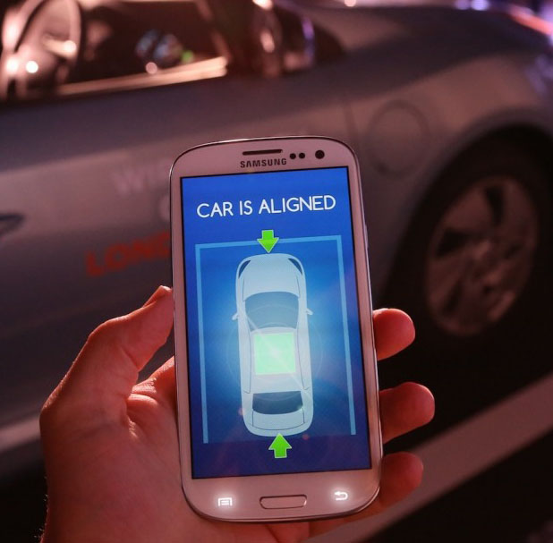
I designed the overall flow for an Android application to inform the driver when the car is aligned with the charging pad. Because of the driving environment, I pushed to keep the graphics simple and used voice prompts and sound effects to guide the user. I ended up recording the audio myself. It was interesting to learn about the ISO requirements for screens in an automotive environment. This was demonstrated at a press conference in London, was covered by Slash Gear, and is currently in a Halo user trial.
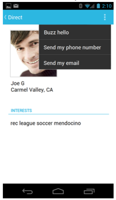
In this project, I worked with an R&D team with technology for mobile interactions based on proximity who needed some new ideas for how they could use it. They had the obvious "coupons in range of the store" stuff, and I suggested they add ways to help people find each other. I created a scenario with "Joe", who had just moved to a new town and was looking for a soccer team. They loved it. I delivered screens for the entire end to end scenario from him entering preferences to him finding a team through a guy at the same coffee shop he was visiting.
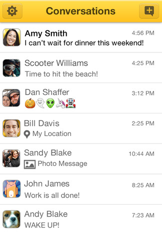
This was a short effort on my part, covering for a colleague on leave. The team already had apps for both Android and iOS, but wanted to improve the user experience. I gave them a strategy for unifying the design between the two platforms based on the commonalities between the two platforms (iOS4 and Ice Cream Sandwich, at the time) and watching out for the important differences (e.g. only "home" key on the iPhone).
This project involved porting an existing Android app to iOS. I started by watching the user testing of the Android app to see what the existing issues were. I put together for the team a primer of the differences between Android and the iOS Human Interface Guidelines. I had to get buy-in for changing the existing UI to fit into the Apple style. I put together the wireframes for all the required task flows, working with my visual designer on layout questions and trying to make improvements where we could.
I worked on a touchscreen version of Brew for a couple years. It was a highly focused, and collaborative effort. We started from scratch, doing competitive analysis and creating a styleguide and all the widgets required to compose the interface. Known as Brew Mobile Platform, it was used for smaller manufacturers to get into the market with a turnkey UI.
The Brew UI was included in certain Qualcomm chips, and was very popular. The Handset Development Kit included the software for the phone as well as an Integrated Development Environment for developers to build their own apps. I worked on keypad Brew phone applications (HDK) for a couple of years. I learned a lot about messaging protocols, calling, multimedia, and Digital Rights Management in the course of my interaction design work on those and other apps.